Business Card Ideas from Things That Don’t (But Should) Have Business Cards
Your business card isn’t just a rundown of how to reach you; it’s also a reflection of who you are. But if you’ve never created your own business card before, a blank template can be daunting. Are you including too much information or too little? Are you including the right information? And does it even look good?
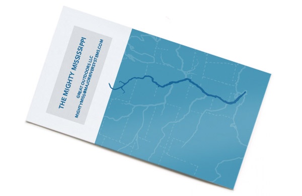
We’ve compiled a bunch of business card ideas to help you accurately and attractively convey what you’re all about, even if what you’re all about is being a river:
1. Consider your industry

Is it better for you to be all business or a little bit playful? Humor and whimsy can be charming, or they can detract from the seriousness of your job. Think about the types of professionals you’re trying to impress and whether they would appreciate a lighter touch or a more straightforward design.
2. Keep it simple
It’s best not to clutter your card with too much information, so leave out the extraneous stuff. Essential information includes your name, your business’s name, and your contact info—any other details should be used sparingly. This allows for more blank space on the card, which can be an aesthetically pleasing choice for a pair of weary eyeballs.
3. Choose a cohesive color scheme
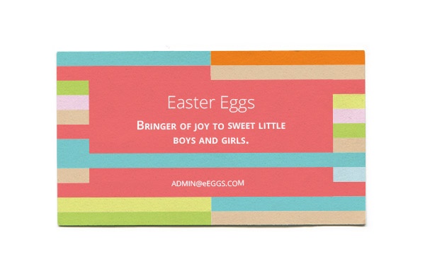
Color helps a card pop, but it can also be overwhelming. Make sure to pick colors that complement each other and fit within a single color scheme.
4. Consider the back of your card
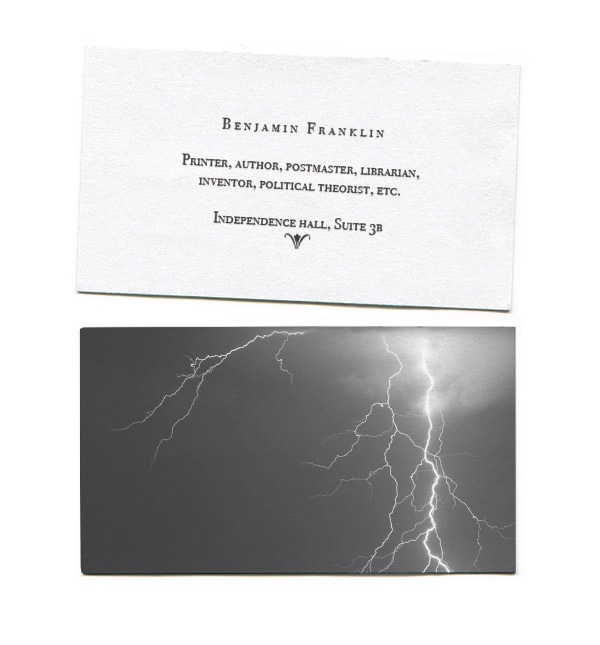
A creative way to highlight your product is by depicting it on the back of your business card. This can also be a place to add a logo or design that exists purely to catch the eye. Many prefer to leave this space blank, which is perfectly OK as well.
5. Stand out in a subtle way
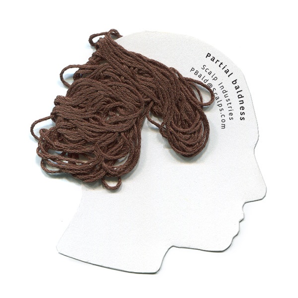
There are a few ways to make your business card stand out without carving it from balsa wood or dipping it in chocolate. You can orient it vertically rather than horizontally or even choose an unusual shape (so long as it’s not awkward to fit into a wallet).
BONUS TIPS:
- Keep your design away from the margins to protect against having text or images cut off. Also avoid borders, since they may turn out lopsided if your cards aren’t printed and cut precisely.
- Consider using high-quality paper and finishes. While more expensive, these elements can convey your professionalism and complement your design.
- Steer clear of overly large typeface—it can come across as cheesy or amateurish.
Illustrations by Greyory Blake, Groupon. Jen Jackson and Sean O'Toole contributed to the anthropomorphism in this article.
Deals in chicago

Deals in chicago Other Deals in chicago